
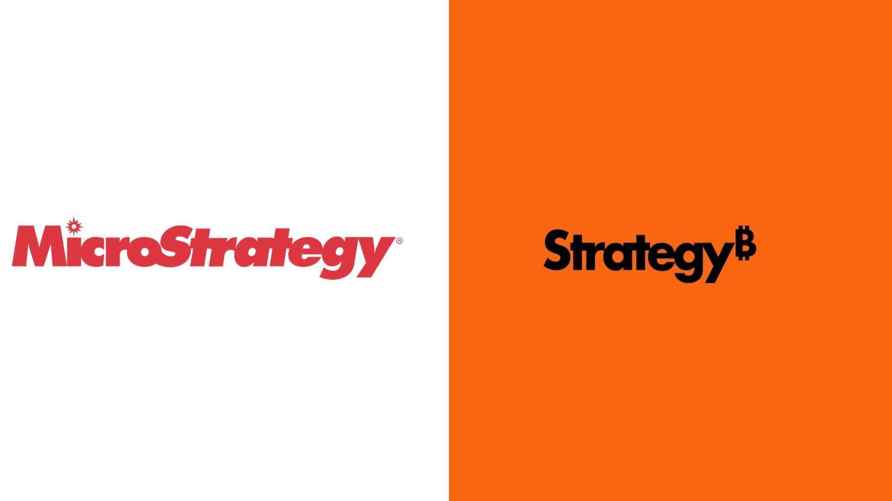
LeatherMint on Nostr: The font is goofy. It should be serious and bold. The colors reminds me of Harley ...
The font is goofy. It should be serious and bold.
The colors reminds me of Harley Davidson. I don't think it fits for a financial brand.
The brand is not Bitcoin. I think adding tue Bitcoin logo depersonalize your own brand and prevent you to go beyond it.
Imo, Microstrategy lost all its personality.
The colors reminds me of Harley Davidson. I don't think it fits for a financial brand.
The brand is not Bitcoin. I think adding tue Bitcoin logo depersonalize your own brand and prevent you to go beyond it.
Imo, Microstrategy lost all its personality.
quoting nevent1q…v5rmAn other proof that Microstrategy is fiat as fuck.
This is almost as tasteless as Jaguar rebranding.
(Yes, this is real and official)