Event JSON
{
"id": "483fdf7d0dd7cc480c62a1cc375910ba55afd18d21197d558e890069fb6ceab9",
"pubkey": "a78ac97563e991a2fb33453067525bd0067cf25d7fbeb732e955ea6090bbfb5d",
"created_at": 1708023124,
"kind": 1,
"tags": [
[
"p",
"932876d50871bc99621d2ece2674d31b53525ad1b79e08fc4690ab91cea3fbee",
"wss://relay.mostr.pub"
],
[
"p",
"34240e776c42958d958ca472cc693f5f50aed00260b1ef74a36920f4695f2cb1",
"wss://relay.mostr.pub"
],
[
"e",
"1cac99c4985bdbee8510c45d2995c13bce52d48210fffba001185ec01837fb92",
"wss://relay.mostr.pub",
"reply"
],
[
"proxy",
"https://mastodon.social/users/afisch/statuses/111937003511052148",
"activitypub"
]
],
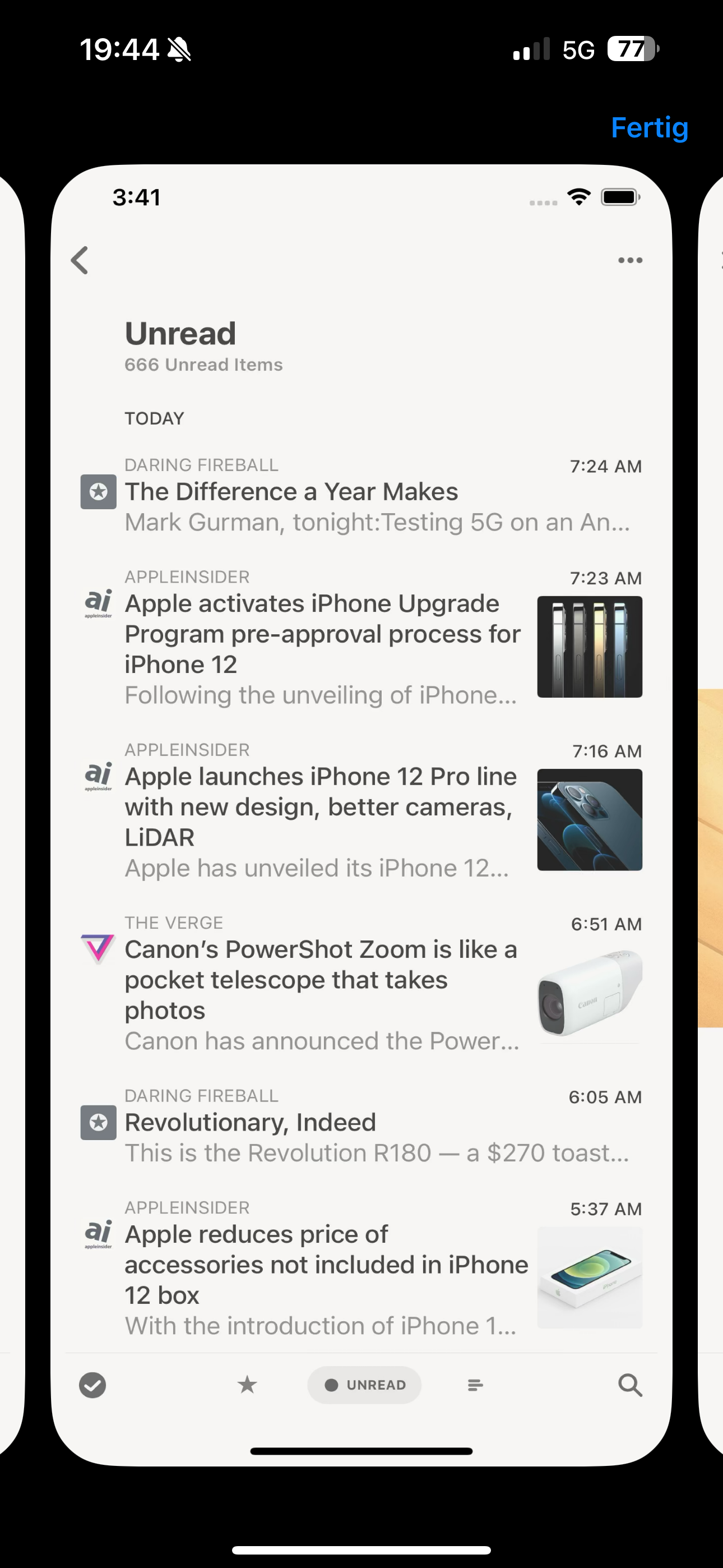
"content": "nostr:npub1jv58d4ggwx7fjcsa9m8zvaxnrdf4ykk3k70q3lzxjz4ern4rl0hqzde22d saw that, but even in small the spaces between the „cards“ are a little annoying. I would prefer a view in more like a list, similar how reeder or feedly display the articles. Somehow feels „calmer“ to scroll through the articles. But that’s just my opinion 🤷♂️\n\nhttps://files.mastodon.social/media_attachments/files/111/937/002/787/886/773/original/28862ad919656b7b.png\n\nhttps://files.mastodon.social/media_attachments/files/111/937/003/250/163/227/original/bf8b95b9fa67c2b4.png",
"sig": "ded88aef88a79ac9fdea57d91efbc40e9516d5e984e4a952d62cfabe7f8db1b53ecbe1a561e6f583f4b65ef14af681e98b403feecb612a16c1e3cdbc94f34ff1"
}


