Mario Guzman 🏳️🌈 on Nostr: This image is from a tweet by designer Michael Flarup. I feel like this really shows ...
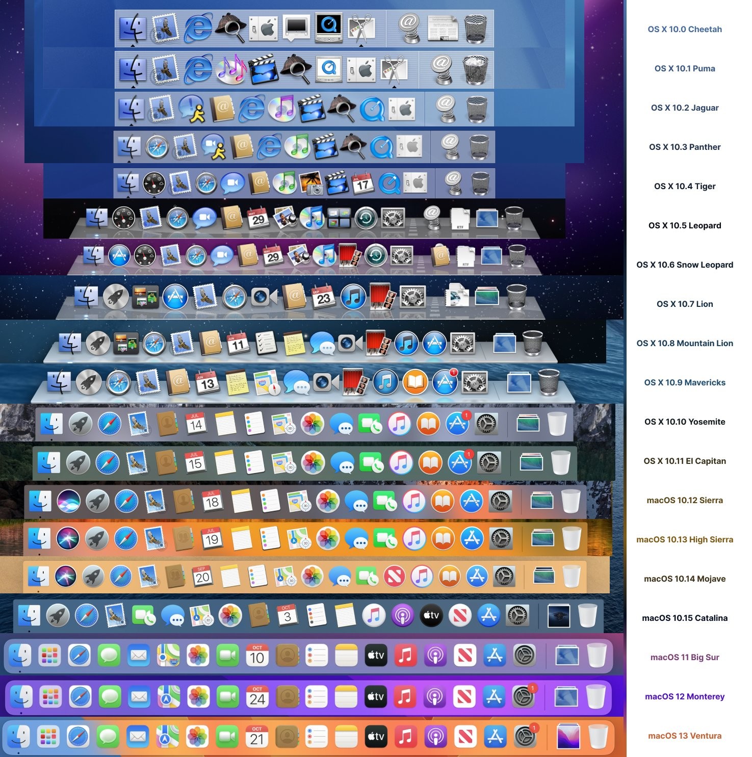
This image is from a tweet by designer Michael Flarup.
I feel like this really shows how boring and uninspiring the Dock has become over the years. It was getting good up until Mountain Lion but then... bleh. and only got worse :(
Icons used to be a representation of the app’s capabilities. Usually clever design too. Now they’re usually just their marketing logo. 😭 artificially confined to a squircle.
