M. Petek on Nostr: Blue is a bad choice of font color because it always appears blurry at the edges. ...
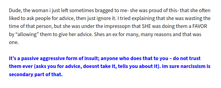
Blue is a bad choice of font color because it always appears blurry at the edges. Blue is the hardest color to focus on (the retina) for the eye.
Remember blue LED displays and how unpleasant it was to read them?

Published at
2024-05-22 17:06:21Event JSON
{
"id": "6e652c77b89525b99f70e069f3f80ea0464308de522430f238deca2e4aa71a68",
"pubkey": "864dad9c456dad35725a1aebe1ba9bd1a94f58b6e8ee3be9bd912935b9d2c892",
"created_at": 1716397581,
"kind": 1,
"tags": [
[
"proxy",
"https://pieville.net/users/Marko/statuses/112485831915332816",
"activitypub"
]
],
"content": "Blue is a bad choice of font color because it always appears blurry at the edges. Blue is the hardest color to focus on (the retina) for the eye.\n\nRemember blue LED displays and how unpleasant it was to read them?\n\nhttps://cdn.pieville.net/file/pievillecdn/media_attachments/files/112/485/803/959/340/459/original/0cce9d5ae38bf4d9.png",
"sig": "f26380d282b99dab081ce029a06852250524812a495719d88ff9b1ec6e02ccd649c14568334ad54915749da2efad0570a54721db4eef9b3cc37b88ca6c2c30f9"
}

