Matt Birchler on Nostr: RE: my recent blog post about the timer and alarm UIs being opposite and confusing, ...
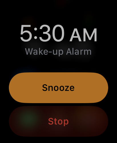
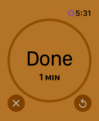
RE: my recent blog post about the timer and alarm UIs being opposite and confusing, Apple has addressed this in watchOS by giving them different interfaces when they’re going off.
Not saying this is perfect, but I’ve never heard someone say they get confused by what to do with these UIs.


Published at
2024-09-17 11:36:51Event JSON
{
"id": "6cc77140de581455edbbdf17e87a7f85cf2db3dc24db4014c046c8bbead191f0",
"pubkey": "8df8e493eb8df7ef38d62ca1a8d9e4885f1e44d7944a2a96f3b37046b02f0df5",
"created_at": 1726573011,
"kind": 1,
"tags": [
[
"proxy",
"https://isfeeling.social/users/matt/statuses/113152688909633904",
"activitypub"
]
],
"content": "RE: my recent blog post about the timer and alarm UIs being opposite and confusing, Apple has addressed this in watchOS by giving them different interfaces when they’re going off.\n\nNot saying this is perfect, but I’ve never heard someone say they get confused by what to do with these UIs.\n\nhttps://cdn.masto.host/isfeelingsocial/media_attachments/files/113/152/688/285/158/804/original/5e70f7e4b4e724ce.png\n\nhttps://cdn.masto.host/isfeelingsocial/media_attachments/files/113/152/688/639/397/156/original/c11389ae92d775d5.png",
"sig": "fbf86242f1736879ace701f02e0eda8fa96c544b29225f7ad639b2425125f2d6b295bb80343d8e8b6e81cb663f1e786b4e1ac62888e1ab44f530e97927861bda"
}
