Steve Easterbrook on Nostr: I'm rather taken with this elegant visualization of @ClimateChange from the BBC. ...
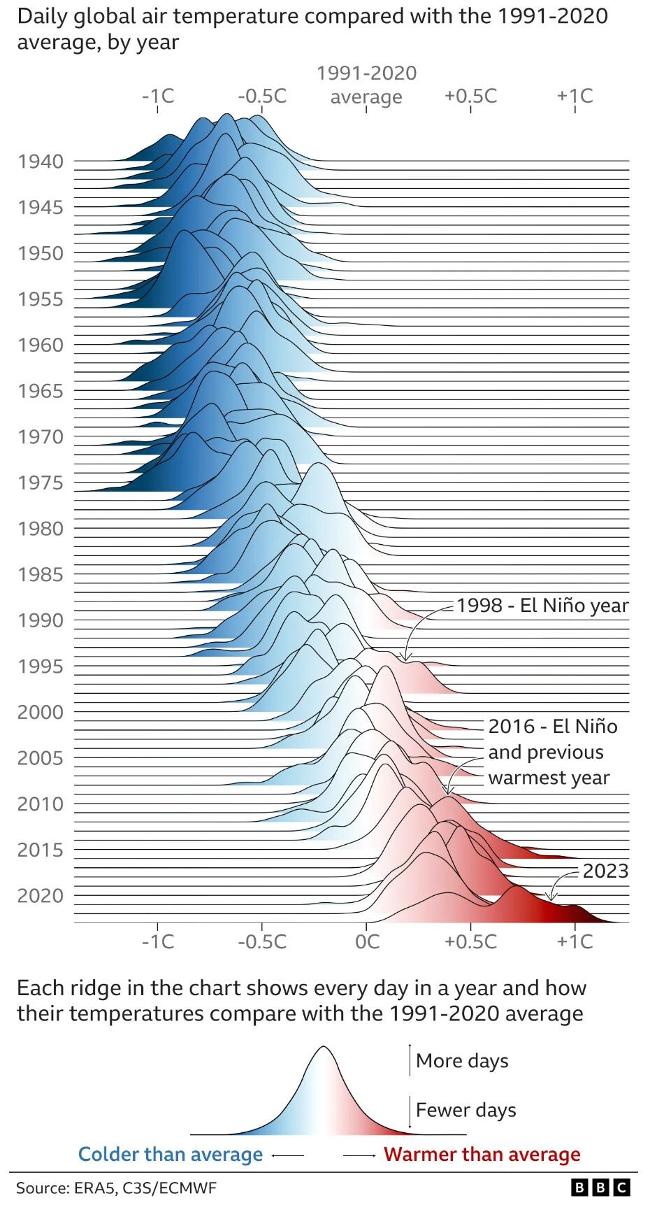
I'm rather taken with this elegant visualization of @ClimateChange from the BBC. Particularly as it clearly shows how anomalous 2023 was.
It's a Ridgeline plot (also sometimes called a joyplot, after the iconic album cover from the band #JoyDivision).
I just wish they'd used a pre-industrial average as the baseline. 2023 was 1.48°C warmer than pre-industrial times according to the Copernicus data.

It's a Ridgeline plot (also sometimes called a joyplot, after the iconic album cover from the band #JoyDivision).
I just wish they'd used a pre-industrial average as the baseline. 2023 was 1.48°C warmer than pre-industrial times according to the Copernicus data.
