Harshil Shah on Nostr: For more design oriented people than me: Any thoughts on how I can make this little ...
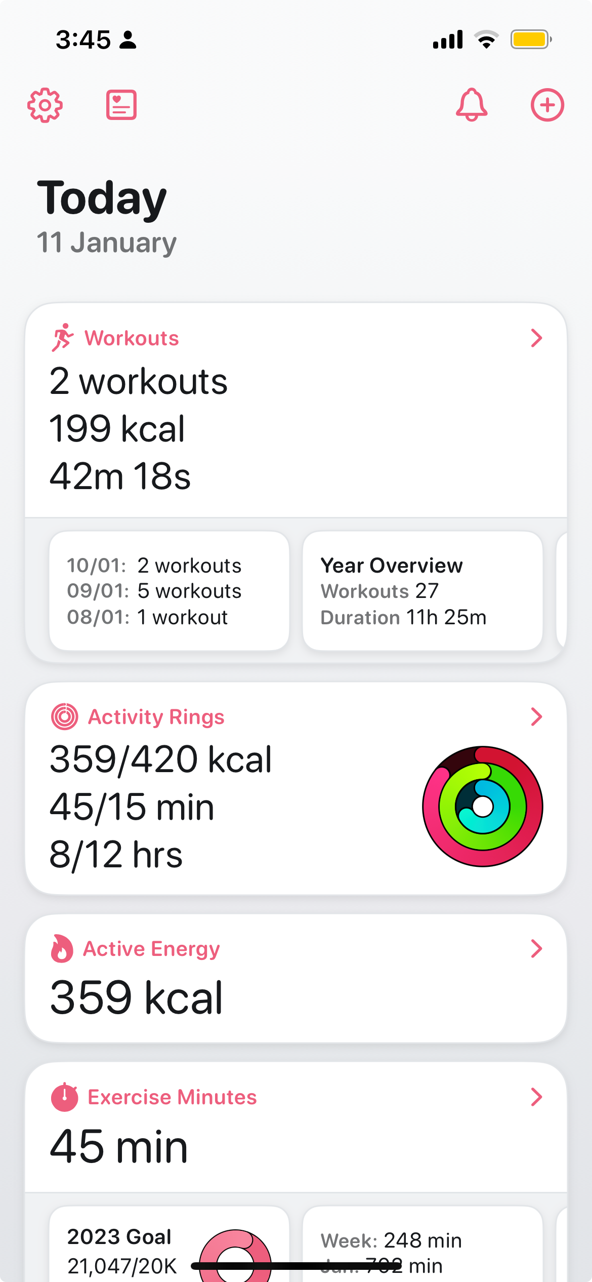
For more design oriented people than me: Any thoughts on how I can make this little strip of info less “busy”?
I like the density, but the overlapping colours and shadows can feel a bit much sometimes

Published at
2024-01-11 10:24:08Event JSON
{
"id": "32723407101de3bae5d14319a2cb737bfabcaceb6a208f07391d1549f7db7a40",
"pubkey": "288bcaa0cab2ae47270f7d12b6bdadfbab5bda6a4b0ca8e1984b5510eae912b3",
"created_at": 1704968648,
"kind": 1,
"tags": [
[
"proxy",
"https://mastodon.social/users/harshil/statuses/111736825339560848",
"activitypub"
]
],
"content": "For more design oriented people than me: Any thoughts on how I can make this little strip of info less “busy”?\n\nI like the density, but the overlapping colours and shadows can feel a bit much sometimes\n\nhttps://files.mastodon.social/media_attachments/files/111/736/825/013/175/553/original/c5e77fdfec75077c.png",
"sig": "a13aebc2a1b048a46d7775544da4c03da0a46187c7a4d7a1238c1c4684fda09e2d6ea0dc18d0c1131cc44b83d8b59d491c6145c7ccb74fcc4bcaa64b2c29bff8"
}

