Mario Guzman 🏳️🌈 on Nostr: Apple, I am sorry but you don't know how to design a good UI/UX anymore. 1. Why does ...
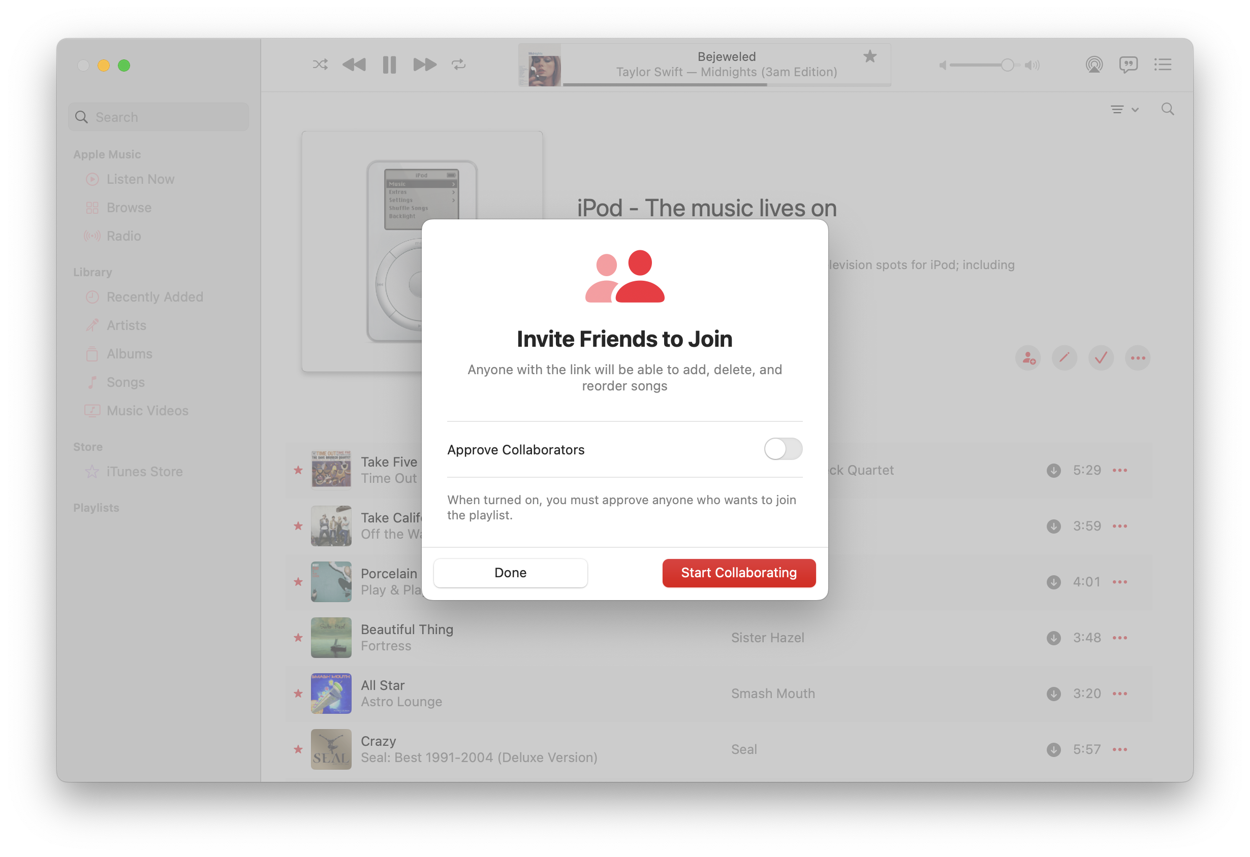
Apple, I am sorry but you don't know how to design a good UI/UX anymore.
1. Why does “Approve Collaborators" need an entire Table row? Checkboxes are also more Mac-y.
2. Why are the “Done” and “Start Collaborating” buttons so tall & wide?
3. What the hell am I supposed to press? Start Collaborating” & “Done” seem like equal triggering actions? Should “Done” have been “Cancel" instead?
4. This feels so damn Mobile, not desktop.
#UIUX #AppleMusic #Macintosh #macOS #Mac #iTunes #macOSSonoma
