Event JSON
{
"id": "1508b6b04b59a71d3900b353db7fecec882a99d58229c11ef3fde5933e7d7dbe",
"pubkey": "118cd39da270a800372ab7276a46b488cca3c40dd2b34f73b857fc8f72fae0f8",
"created_at": 1704641455,
"kind": 1,
"tags": [
[
"p",
"66e689e06af966eb3f3d6a330d2f8f81eefcc2d057dd4d717fff965653035549",
"wss://relay.mostr.pub"
],
[
"p",
"f7b6d1d9935f2c4ff3a3d6c3d843174dd7a6c246f77657a496b6d9acfb43671d",
"wss://relay.mostr.pub"
],
[
"e",
"6d831d70155a8e54ccba8f9b835f5047f14239206bfc9780d29ba54bb01c20a1",
"wss://relay.mostr.pub",
"reply"
],
[
"proxy",
"https://mementomori.social/users/rolle/statuses/111715382417590192",
"activitypub"
]
],
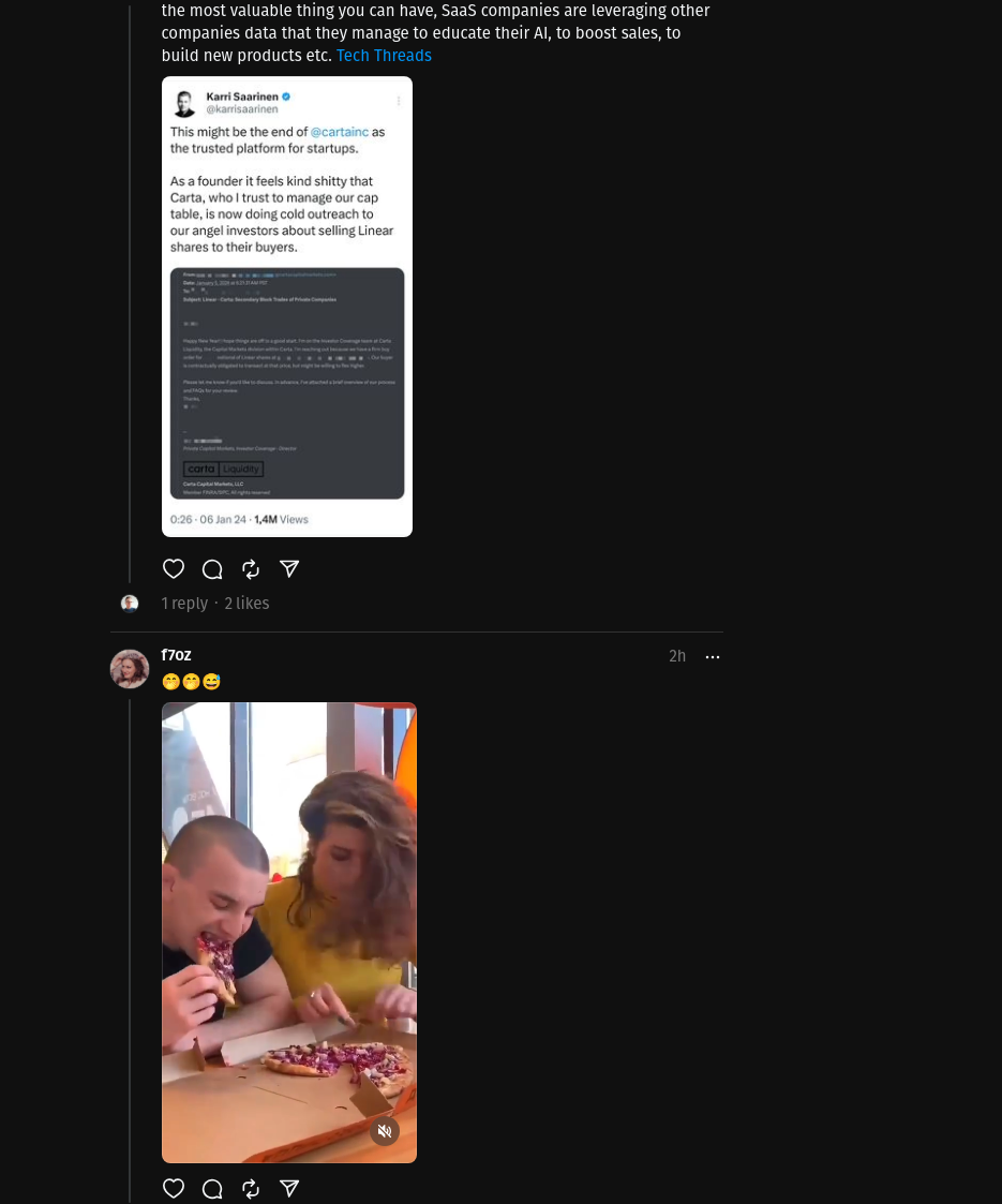
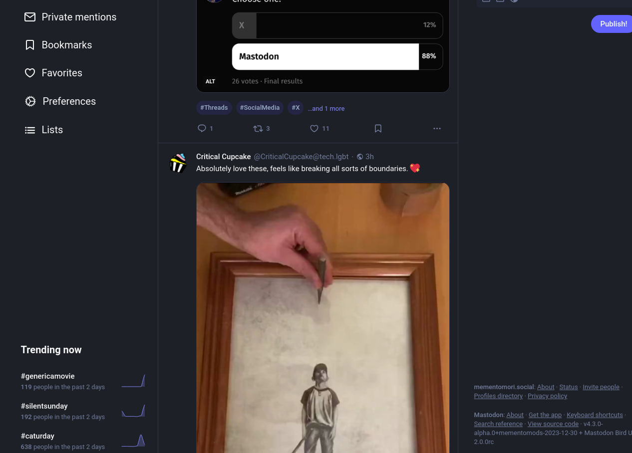
"content": "nostr:npub1vmngncr2l9nwk0eadges6tu0s8h0esks2lw56utll7t9v5cr24yswlwwyk No space is \"wasted\" if it serves its purpose. It's the basis of the white space concept in web design. Threads UI has embraced it and I'm very excited about that. Otherwise those long video posts get very tall and you can't see them fully anwyay.\n\nFor comparison:\n\nhttps://media.mementomori.social/media_attachments/files/111/715/379/156/982/116/original/90653e488ce82cd2.png\n\nhttps://media.mementomori.social/media_attachments/files/111/715/381/350/463/903/original/69b40256e80d7aae.png",
"sig": "3e16f00adf3b68d1a7037413d600ace56c212244a1cdeb3db2084027ae38c464ff287fa3e56b88d498067771ab64d35f50573db8c5fe3ea598dcb21357d39ace"
}


