der Laokrat (he/him) on Nostr: npub1cmgqv…wrzd2 Wonderful! Might I make a suggestion? One thing that looks ...
npub1cmgqvz7xr07euwkum3mjghjqcu4d3k2fcyf6g4uwwe5ggnd6fetq0wrzd2 (npub1cmg…rzd2) Wonderful!
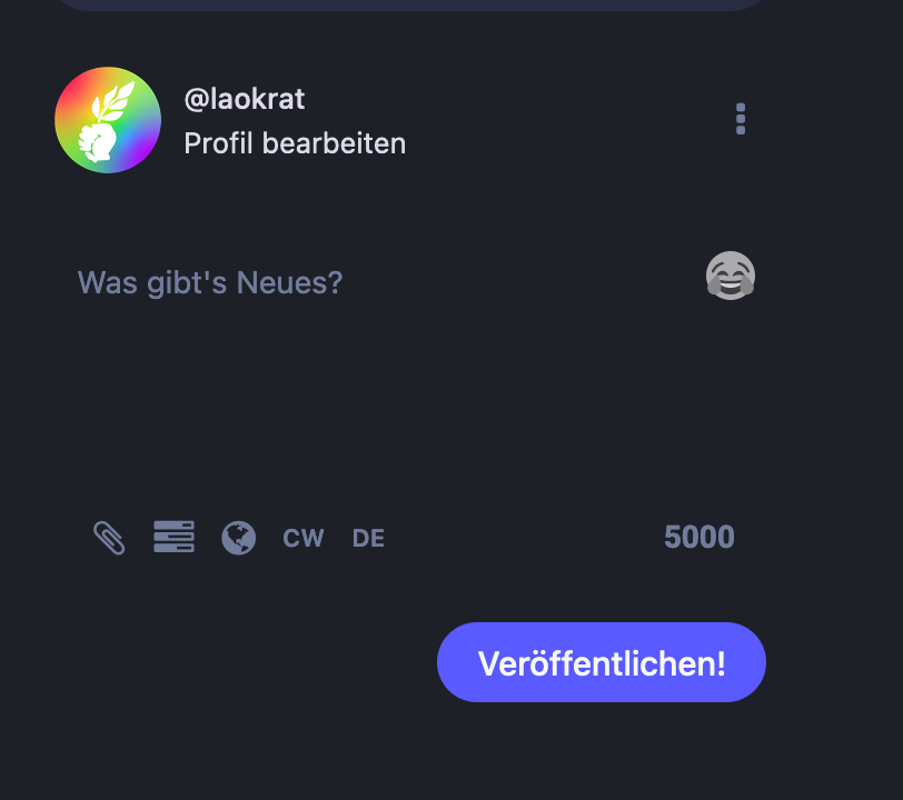
Might I make a suggestion? One thing that looks somewhat unfinished is the toot-editor itself.
First of all: it can be hard to make out, because there is no border around it. The Birdsite has the editor fenced in, so to speak.
Second, the buttons/symbols below the editor (for attachments, visibility, CW, language are quite small, lack white space and don't align with the beautiful symbols you used for the menu.
So all in all, the editor is where I see most room for even further improvement.
Thank you for everything you're doing! <3
