jamw on Nostr: The reason for this stylization of the “1” as a “J” comes down to historical ...
The reason for this stylization of the “1” as a “J” comes down to historical handwriting and typographic conventions. Here’s why it happened:
1. Calligraphic Influence
Before standardized printed fonts, numbers were often written in a decorative or cursive style. In many scripts (especially in Germanic and Dutch regions), the number “1” was written with a long leading stroke, sometimes curving at the bottom—eventually resembling a “J” in some cases.
2. Blackletter and Gothic Typefaces
Many European countries, particularly Germany, used Blackletter (Fraktur) and other Gothic scripts well into the 19th century. These scripts had elaborate, curved strokes, which made the “1” appear more like a “J” when engraved or printed.
3. Stone Carving Techniques
Inscriptions on buildings were often chiseled into stone or cast in metal. The numeral “1” was sometimes carved with a serif or a decorative flourish at the top and bottom, leading to an appearance that could be mistaken for a “J” by modern viewers.
4. Lack of Standardized Numerals
Before modern typography and widespread printing, there was no universal way to write numbers. Regional variations in handwriting and engraving meant that the “1” could take many forms. Over time, the elongated style persisted in certain areas.
5. Gradual Disappearance
By the late 19th and early 20th centuries, modernized typefaces and printing techniques led to more standardized numerals, making the stylized “1” with a tail fall out of use. Today, it mostly survives in old building inscriptions and historic documents.
This is why you see dates like “J845” instead of “1845” on older European buildings—it’s not a “J,” just an old-fashioned way of writing “1”!
It’s not always at the beginning of the date either: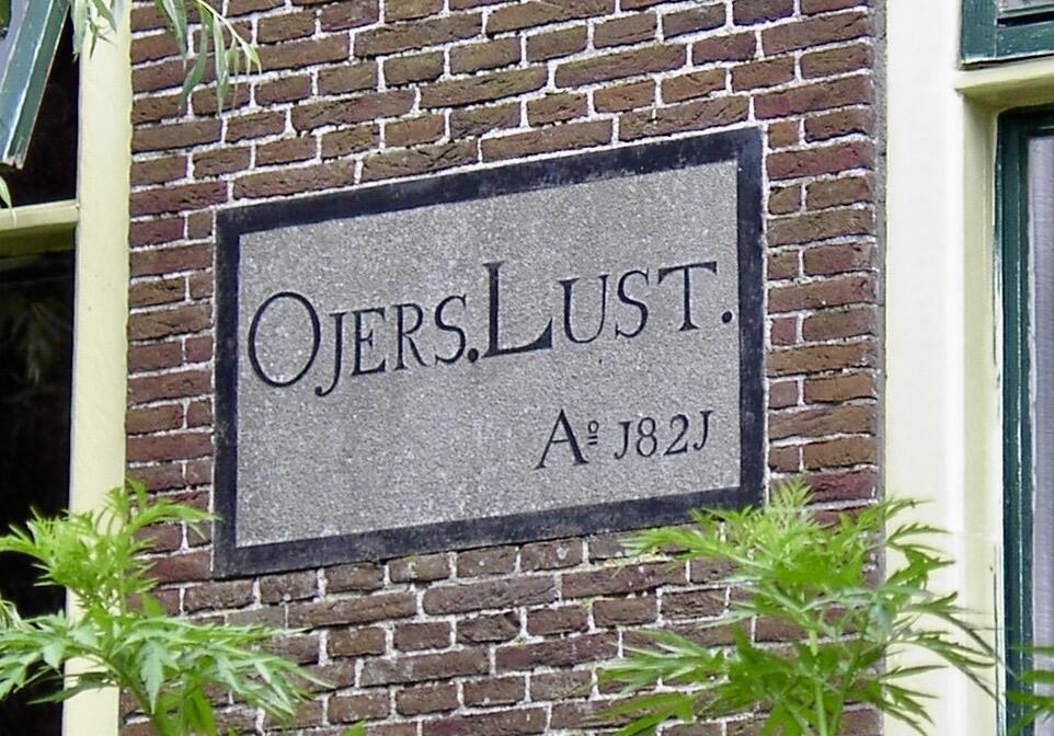