Dan Piponi on Nostr: Google makes terrible design decisions. It's so hard to distinguish the icons they ...
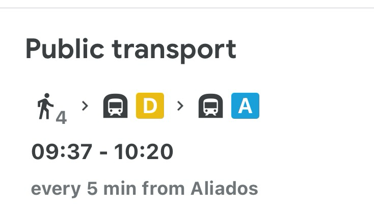
Google makes terrible design decisions. It's so hard to distinguish the icons they use for transport. You have to look really closely to see that the little marks under the vehicle represent rails, not wheels. And the black background presumably indicates a tunnel. So this is the subway. But it's not, it's a tram that travels above ground.
I like words.

Published at
2024-06-04 09:53:18Event JSON
{
"id": "558d160f2905114ca8a23dce627686c2d2b780bae923663abc4c9f3fb21a0994",
"pubkey": "3422fcbc32f333fb2d3481b2e981258af8a0b571869cbfe93c42962410e232ef",
"created_at": 1717494798,
"kind": 1,
"tags": [
[
"proxy",
"https://mathstodon.xyz/users/dpiponi/statuses/112557739100274462",
"activitypub"
]
],
"content": "Google makes terrible design decisions. It's so hard to distinguish the icons they use for transport. You have to look really closely to see that the little marks under the vehicle represent rails, not wheels. And the black background presumably indicates a tunnel. So this is the subway. But it's not, it's a tram that travels above ground.\n\nI like words.\n\nhttps://media.mathstodon.xyz/media_attachments/files/112/557/723/430/017/021/original/92ca4f16712eb006.png",
"sig": "ebb8b11ff7485efd963fd594dba85fb5e6c68ce042fffe756b64fb08e6ce5caf11deff836c3795f9ae3c53ad91e3bc86a4ce69ec28ceeef988927c0c8f18f306"
}

