Mark Wyner :vm: on Nostr: Hi, npub1cx7gl…28tc2 and npub1xzmt2…0eykm The new UI looks fantastic. Well done ...
Hi, npub1cx7gljur9tl4zss45ekcm0xuw20v4xxx0337695dq5xr468wpeasc28tc2 (npub1cx7…8tc2) and npub1xzmt2d95f7watzyqktl982d7jfe5ptktusv4j20csz8nxxgmhq6q30eykm (npub1xzm…eykm)
The new UI looks fantastic. Well done by your team. Two pieces of feedback from me, though. For free.
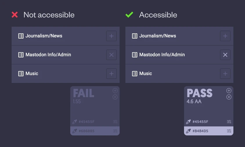
1. The contrast between icon/background in the lists modal is inaccessible. It fails WCAG guidelines. I mentioned this back in February (https://mas.to/@markwyner/111931171140519265).
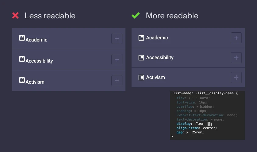
2. The failed icon/label alignment and gap. Here's simple CSS that can fix it. This also saves lots of space for long lists.
I hope this helps.
#Mastodon #Redesign #UI #Design #Accessibility #A11y #CSS

