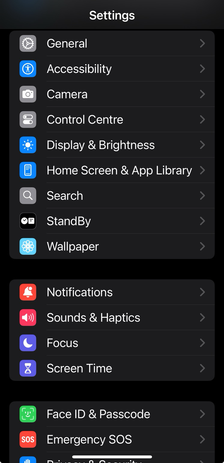
Public Enemy Exposed on Nostr: The new UI in #iOS18 is just horrible - looks like the experienced staff with an eye ...
The new UI in #iOS18 is just horrible - looks like the experienced staff with an eye for aesthetics have all left #Apple. Things are all over the place. 🤦🤬 Take the 'Settings Menu' - the indents are way too big and it feels like everything is meant to squeeze into a phone with a narrower screen. #iPhone

Published at
2024-09-16 23:16:13Event JSON
{
"id": "717f9f4cfc199d4654a11cb1b9eac989d09c6135dfb14a897e04ba8daff323c7",
"pubkey": "fb6584714a4360c722646484bef3aafa9ba9f9b77568e0698309992689c8d33d",
"created_at": 1726528573,
"kind": 1,
"tags": [
[
"t",
"ios18"
],
[
"t",
"apple"
],
[
"t",
"iPhone"
],
[
"proxy",
"https://mastodon.online/users/pee/statuses/113149776621823106",
"activitypub"
]
],
"content": "The new UI in #iOS18 is just horrible - looks like the experienced staff with an eye for aesthetics have all left #Apple. Things are all over the place. 🤦🤬 Take the 'Settings Menu' - the indents are way too big and it feels like everything is meant to squeeze into a phone with a narrower screen. #iPhone\n\nhttps://files.mastodon.online/media_attachments/files/113/149/775/495/565/587/original/5df16560ec4f6409.png",
"sig": "393070f0faad0d2cd653f44c12c9ce23da0bf32b579fdc1c65f8a4b2428cb115901614667e253af2a7bb4c6a82017d94d7824156c4c707a1a09c5a897b457dc3"
}

