Pohjanmies on Nostr: Well, to me it looks like the two columns are correct. But there is only limited ...
Well, to me it looks like the two columns are correct.
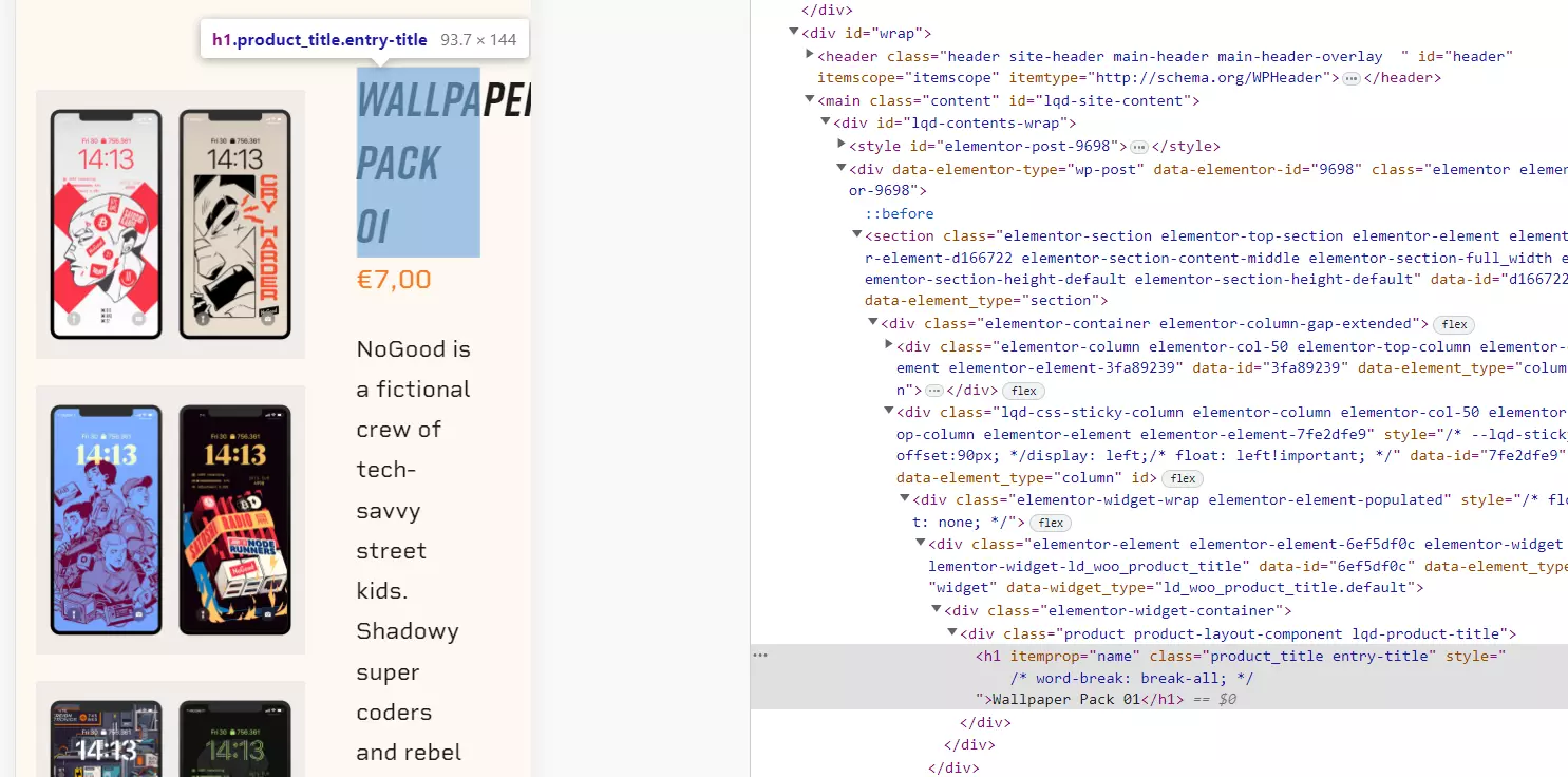
But there is only limited space for the headline.
See Image 1
A word-break would fix it, but it looks ugly to me.
Image 2


Published at
2023-04-06 08:50:15Event JSON
{
"id": "76a688cc491d05ca86140b0d846e3f13e1c567ca6273e9e1ec96056f7aaf1252",
"pubkey": "aa889ab67c5bf6c7886ef4fda58202f7af420b600eb13ab87301dd062203f0bb",
"created_at": 1680771015,
"kind": 1,
"tags": [
[
"e",
"24c5fbb77e91d613186e87f38fe6fffc0a0f65ef17c8bbf2636388a65ab408db",
"",
"reply"
],
[
"p",
"55f04590674f3648f4cdc9dc8ce32da2a282074cd0b020596ee033d12d385185"
]
],
"content": "Well, to me it looks like the two columns are correct.\n\nBut there is only limited space for the headline.\nSee Image 1\n\nA word-break would fix it, but it looks ugly to me.\nImage 2\n\nhttps://void.cat/d/EQzwtU9j4bGmiiTX6hHiRQ.webp\n\n\nhttps://void.cat/d/Enz6vDzLPq5YK6swUXAsBy.webp",
"sig": "0fc274425e18743bdeef5ff507c631fc9788cb20f1aa3c6c3aacae956b6e401609aaa2479f264d197813f0e7b8e573ea2e0e584f9cd7b48283168d3986124d5a"
}


