Fabian :blobcatlul: on Nostr: Hm am I the only one who feels like the new "Tab Overview" of #libadwaita is far from ...
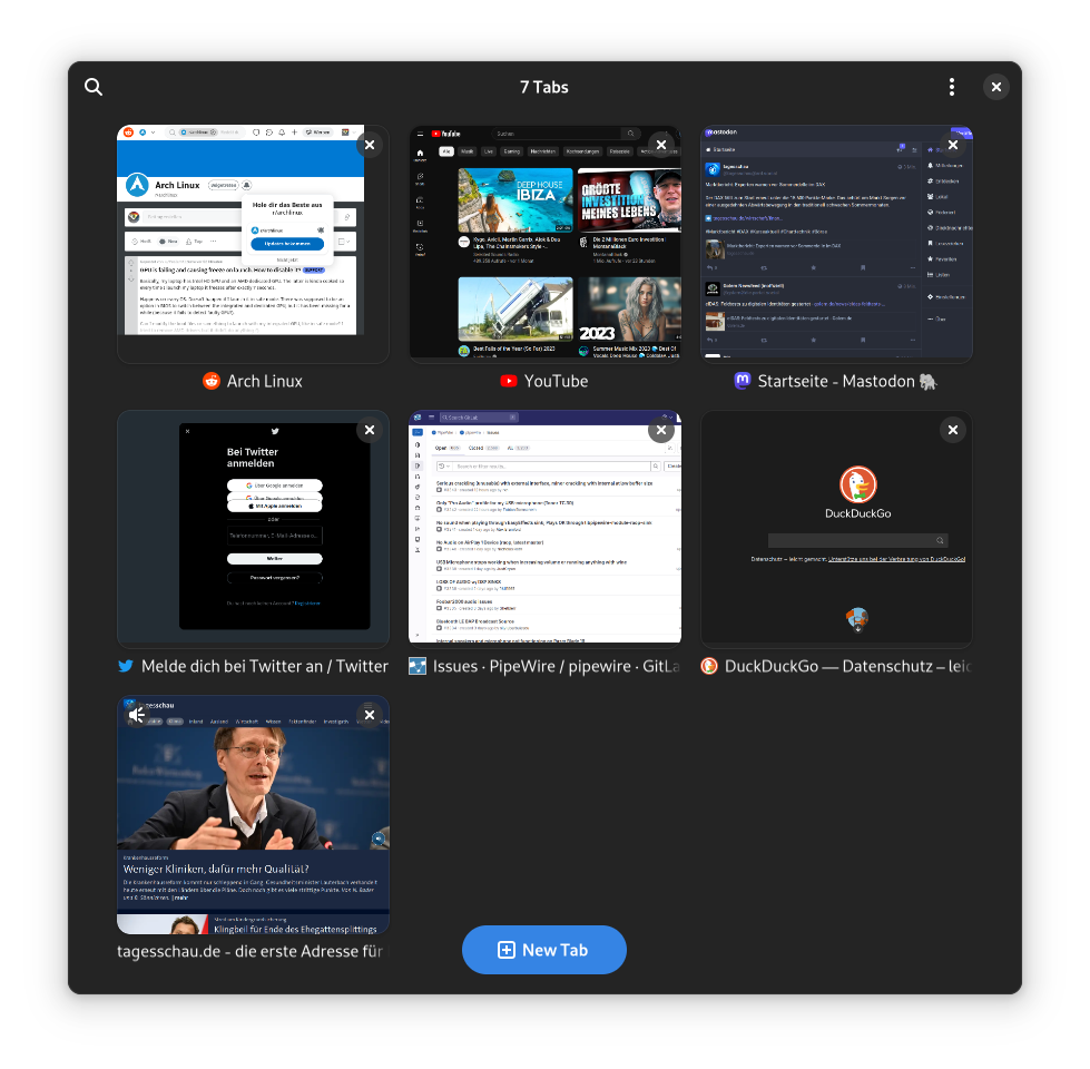
Hm am I the only one who feels like the new "Tab Overview" of #libadwaita is far from usable in #epiphany / #gnome web?
I know most of them are technical limitations and or more usable on different form-factors (like mobile). I'm also not against the concept in general. I just can't find a reason to ever use/enjoy it on the desktop/tablet.
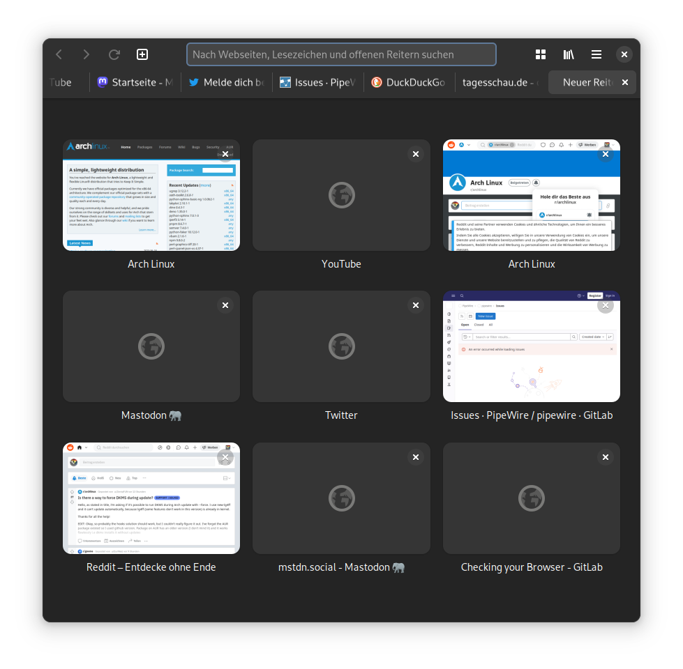
1. Epi does have a "recent visited" 3x3 grid for new tabs that looks just about the same as the tab overview.
🧵️…

