Veenk on Nostr: Now veenk.org is not responsive, only work for mobile and desktop (breaks from 768px ...
Now veenk.org is not responsive, only work for mobile and desktop (breaks from 768px to 1024px displays), we will change this in the new version.
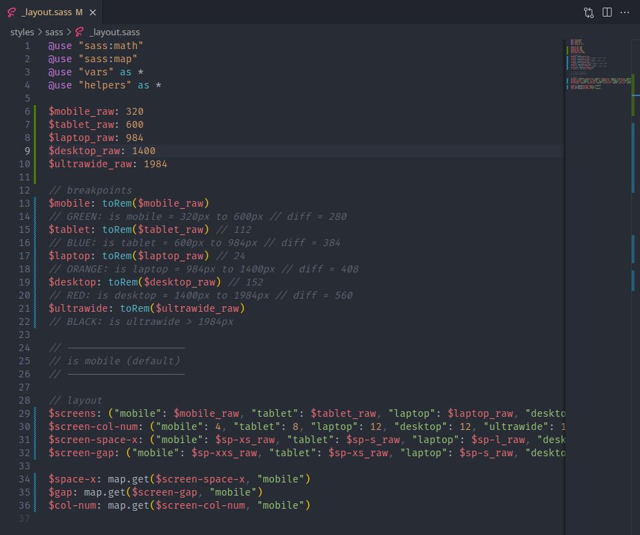
These are the breakpoints we have chosen:
- mobile: 320px - 600px
- tablet: 600px - 984px
- laptop: 984px - 1400px
- desktop: 1400px - 1984px
- ultrawide: more than 1984px
We also change from sm, md, lg, xl to a more descriptive naming and a color system to make easy identify each screen.
// Green and Blue = mobile and tablet
// Red and Black = desktop and ultrawide
Stupid but motivating 😆

