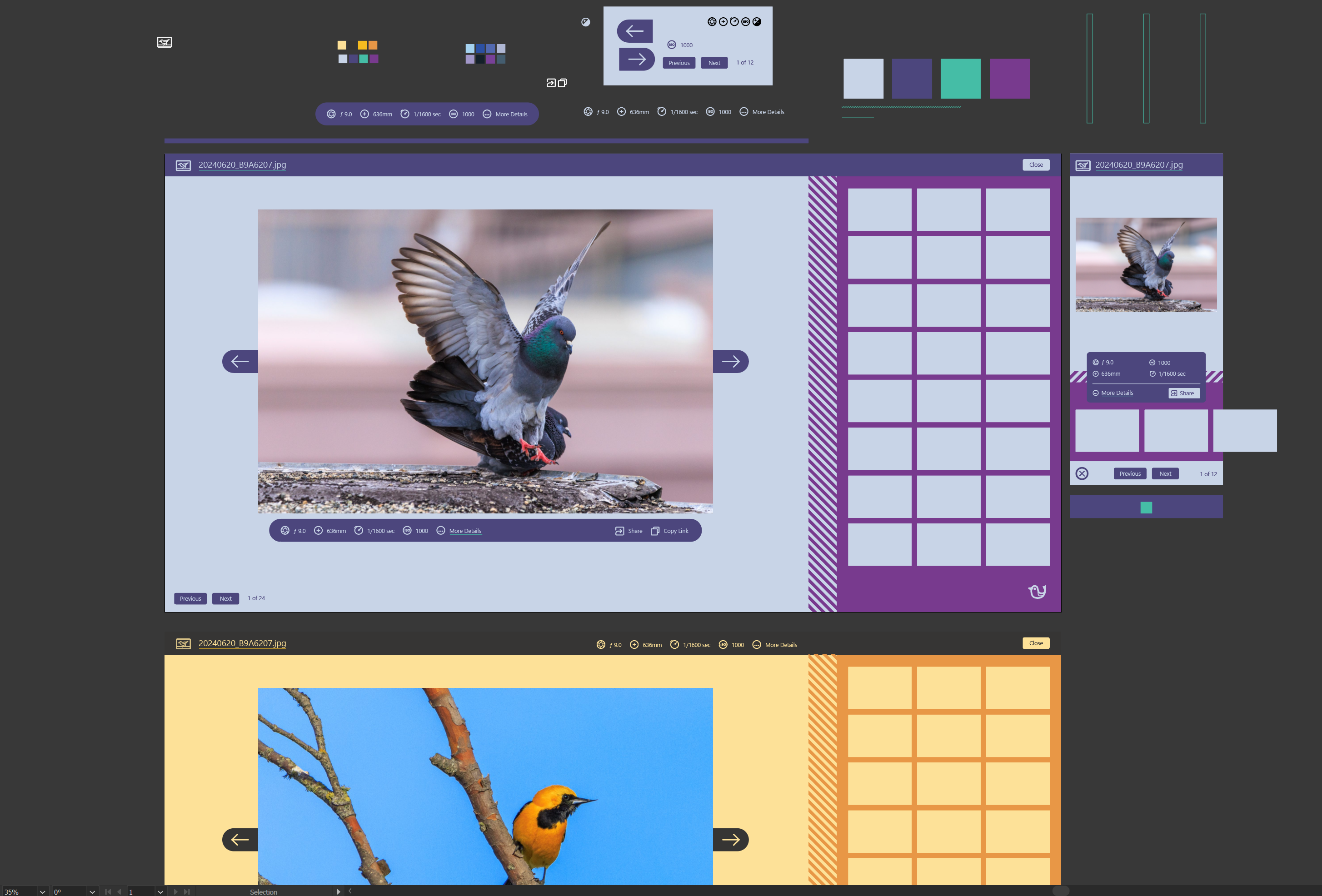
Chris Price on Nostr: Four months later, it's time for a real design. One of the things I've struggled with ...
Four months later, it's time for a real design.
One of the things I've struggled with throughout this project is making everything look and feel cohesive—that design elements, patterns, and colors are well-distributed and used in somewhat consistent ways.
The overall design is inspired by scrapbooking, colored paper, stationery, cards, tape, stickers—combine with birds and it's a colorful paper field guide.
The first draft image viewer [upthread] looks like a sheet of flimsy tissue paper with stuff scattered all over it. It needs structure, and I think this does it.
