Karnage on Nostr: What I like about this logo: 1. It's simple 2. It's bold, it looks great when scaled, ...
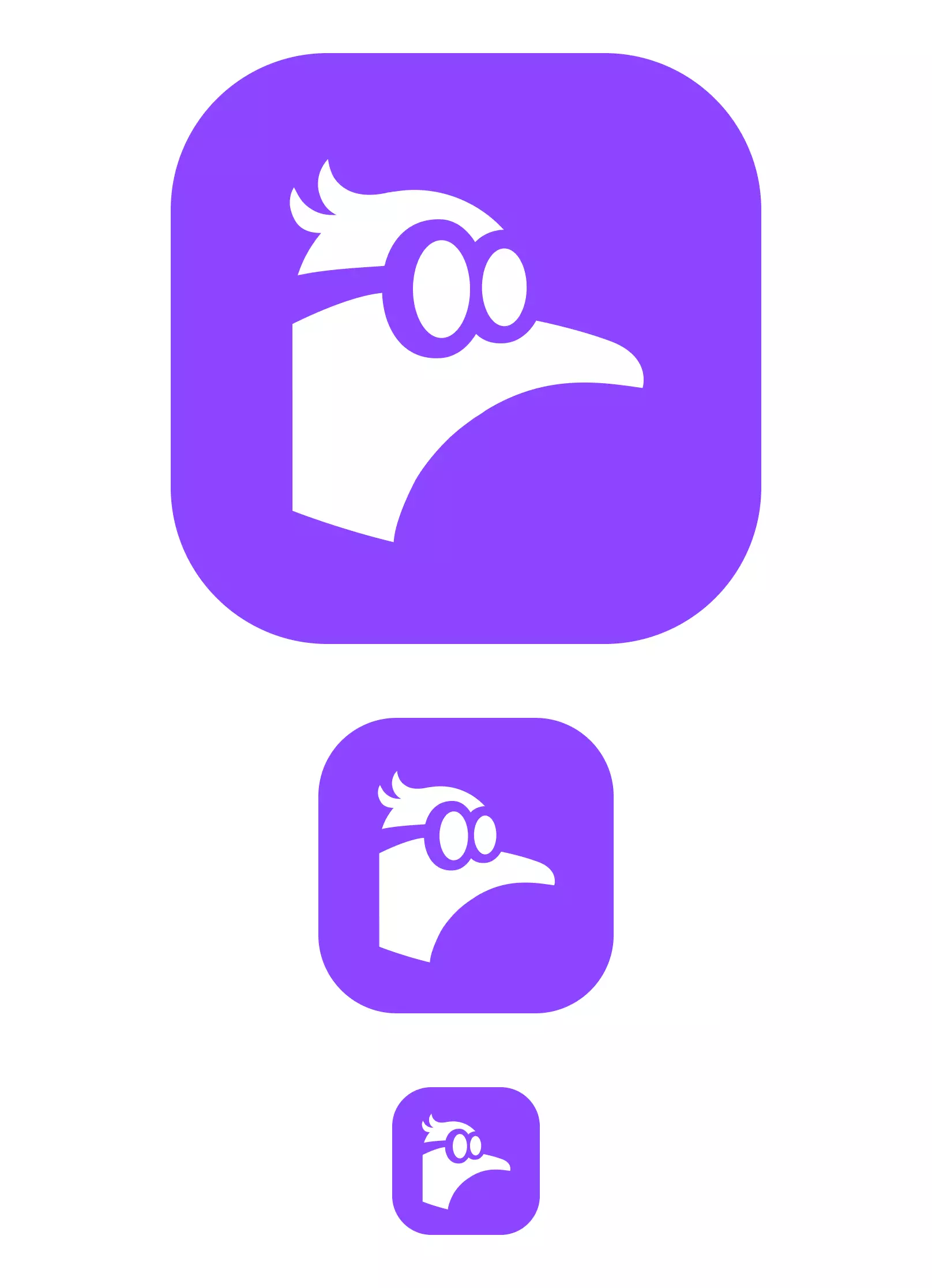
What I like about this logo:
1. It's simple
2. It's bold, it looks great when scaled, small or large, unlike some ostrich logos with tiny legs.
3. It's not generic or boring - think "N" or nodes... those are easily forgettable.
4. It works on any color
5. It works in reverse. If you put this on a glass, you can make out the logo from the other side and still be able to tell what it is.
6. It's quirky, nerdy and a bit humorous. I find this close to the attributes of Nostr - a nerdy name with nerdy concepts but still represents fun and great people.
7. It's a bit playful - fitting for a social protocol
8. Easy to visualize and remember. Nostr = Nerdy bird. The O's could symbolize (O)strich, and once people connect Nostr + Ostrich = Nostrich, it's even more fun.
9. It doesn't take itself too seriously. Some logos try too hard imo and are easily forgettable.
quoting note1n7u…v777Starting to like it. I think it could work. Credit to whoever made it, hopefully they created it from scratch.


